


Romance Your Customers With Compelling Social Media Images

You know it when you see it: The Instagram image that stops you mid-scroll. Yes, it’s jewelry.
You see jewelry everyday but this…this is something special. You linger. Maybe you click. Maybe you save the image to revisit later.
It’s true that a lot of jewelers are allotting substantial resources to elevate their brand creative and, in many cases, have the budget to hire a social media specialist or talented photographer to help make their product shine from all angles. But even if your team is small—that shouldn’t deter you from trying to present your store’s inventory in the most alluring way possible.
What does it take to DIY the kind of images that make consumers’ thumbs stop scrolling and their hearts flutter over and over again? For starters, set the mood for romance!

Artcarved of Frederick Goldman
When you’re in jewelry, you know that a theme of romantic love is relevant 24/7. Valentine’s Day comes and goes but it’s one of those holidays that attunes you to want to shop for jewelry and there’s something about those pinks and reds, the hearts, the diamonds, that is perennially appealing.
Whatever creative direction you take, “The most important element that is often overlooked is the question of ‘does this make strategic sense and lead back to a bigger picture goal/objective?’” says Ben Smithee, CEO, The Smithee Group, an agency specializing in digital marketing. “There is a big difference between ‘art’ and ‘creative’ as art can just be beautiful and creative has a strategic objective it must accomplish.
“Social content needs to be thought of as a cohesive approach to strategic storytelling that builds a brand. Do your visuals map back to the core brand elements? Does the way you show the story help ‘tell’ the story? Does the image cause wonder to search/find out more? Does it make me want what you’re selling? Social today is either brand building or direct conversion— it either needs to help build the narrative that is continually being told, or it must try to convert me into a customer right there.”
As for the composition of the images themselves, Robin Zachary, a prop stylist, educator, and author of the book Styling Beyond Instagram (2022 Schiffer Craft), suggests using paler variations of your brand colors as the background.
“I also like a pale blush pink or apricot for gold pieces or a pale blue for silver and platinum,” she says. “You can buy colored mat board from an art supply store.”
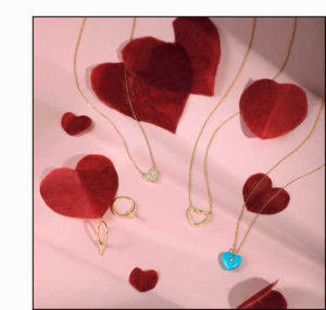
Aurelie Gi of Chic Pistachio
For still-life product shots, props can be as simple and readily available as a small velvet box, a colored block, or cloth book. “A single stem of spray roses or other flower like freesia or orchid in the photo background can express the message of love,” adds Zachary, who also teaches a commercial prop styling class in New York called The Prop Styling Experience. “Or a swirl of satin ribbon can add a nice touch and imply that it’s a gift.”
You’ll have to experiment a bit to get the composition and lighting exactly right. “Try the portrait setting if you’re using your iPhone or a macro lens on a DSLR camera to get up close and see the details while blurring the background a bit,” she says. “And get a little pocket mirror so you can reflect some light on certain spots or facets in the stones.”
Most Plumb Members provide their retailer partners with a steady supply of compelling campaign or still-life images for use on their digital platforms. It’s a no-cost solution that allows stores to surface the brands and product they carry to a wider audience with professional, high-quality creative. Often these photos tell a larger story about romance, love in all its forms, and the pleasure that comes to treating yourself to a luxury purchase that’s chic and meaningful (or both at the same time).
For Valentine’s Day Aurelie Gi, a division of Chic Pistachio, kept it classic “with traditional valentine colors and objects,” says Katherine Whitacre, U.S. sales director. “To stay on-brand, we added a fun, sweet touch with lots of pink, and highlighted our bestselling heart designs, including our Reversible Puffy Heart in turquoise, for an extra pop of color.”
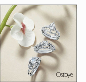
Ostbye
Looking ahead, some TPC members are developing their spring campaigns as we speak.
“We are keeping our color palettes simple so they will work well blending in with anyone’s social media campaigns,” says Theresa Namie, merchandise manager at Ostybe. “Our marketing specialist is developing a new campaign for spring/summer around proposals, called ‘Sharing Ostbye Love’. She is still working on the details, but it will be a chance for retailers to post their customer’s proposal stories—with our help. Our bridal reels have also been successful so we will be creating more of those for spring and summer.”