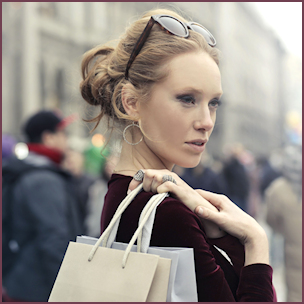


Friendly, Relatable Colors
The trends reflect our desire for stability, creativity and more spontaneous approaches to design.
Colors prevalent on the New York runways for Spring 2020, identified by Pantone are hailed as friendly, relatable and familiar. The Color Institute cites 12 top fashion colors and four classic neutrals it describes as infusing heritage and tradition with a vibrant, youthful update in strong multi-colored combinations and energizing, optimistic pairings.
The trends reflect our desire for stability, creativity and more spontaneous approaches to design says Leatrice Eiseman, Executive Director of the Pantone Color Institute. “In this era of personalized self-expression, this palette of recognized favorites leverages on its familiarity, while adding unique twists and turns, and elements of humor, modernity and entertainment.”
 Eiseman relates the latest fashion colors to be reflective of the current political and cultural climate, citing a pervasiveness of blue signals people want calm and stability. In fact, Pantone coined Classic Blue as 2020 Color of the Year. Also in the palette is a dark Navy Blazer, rich teal Mosaic Blue, and soft Faded Denim.
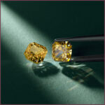
Pantone’s palette includes two shades of green: a savory Chive and refreshing aqua Biscay Green. Orange continues to be a color to watch, evolving from Pantone’s 2019 Color of the Year, Living Coral. On the softer side is warm Coral Pink, and with more wallop are tangy Orange Peel and spicy Saffron this year.
Rounding out the spring selection is a fiery Flame Scarlet red; warm, earthy Cinnamon Stick; purple Grape Compote, and four neutrals — buttery Soft Sunlight, low-key khaki Lark, creamy taupe Ash, and crisp Brilliant White.
The takeaway from most fashion rundowns is a collective yearning for optimism, with colorful self-expression the overarching theme, as society abandons color rules to wear colors that make us feel good year round.
Calm & Stable
Color of sky and sea, blue both grounds and uplifts us. “We’re living in a time that requires trust and faith,” describes Eiseman. There’s a “constancy and confidence expressed by Classic Blue, a solid and dependable blue we can rely on. Classic Blue provides an anchoring foundation and encourages us to expand our thinking, increase our perspective, and open communication.”
As Laurie Pressman, Pantone vice president expressed in an interview with the Associated Press: “Everybody’s 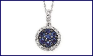 comfortable with blue. We know it. We like it.” Classic Blue reflects what people feel they need that color can hope to answer.
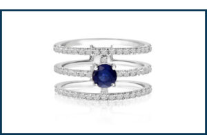
This ”blue-sky” thinking inspires design across this color spectrum. Trends forecasted by The Futurist for The Plumb Club identify sapphire as surging in popularity, as well as gems like opal and moonstone.
“I was so excited when I saw the Pantone Color of the Year,” cheers Theresa Namie, merchandise manager for the Minneapolis, Minnesota based manufacturer, Ostbye. “It’s Ostbye’s 100-year anniversary and our color is classic blue! It was meant to be. It also is a very American color — think red, white and blue, denim. It fits in with the organic trend that’s in place, too.”
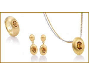
Blue topaz in a variety of shades is a market favorite for the German-design inspired brand Breuning, based in Lawrenceville, Georgia, as well as amethyst and peridot in silver and gold. Topaz is particularly popular in a variety of blues for the brand.
In fact, Allison Peck with the New York brand Brevani concurs that blue topaz and amethyst have consistently been bestsellers in the semi-precious gold jewelry category. “Hearing Classic Blue made the Pantone Color of the year reiterating what our clients know,” she cheers, noting that blue sapphire and blue topaz in non-traditional shapes like trillion an trapezoid are leading the pack. Fancy cuts in general are hot, including oval, pear, marquise, octagon, and half moon; elongated and baguette styles; faceted tops; and different setting orientations.
 Pops of Colors
The trends forecasting service, WGSN expects “neo-mint”, a neutral pastel green to dominate fashion as a close second to blue. Gems like mint garnet and tourmaline brilliantly complement this direction. In fact, the pairing of blue and green remains a leading trend with gemstones in jewelry design.
Evolving from Pantone’s 2019 Color of the Year, Living Coral, Amanda Gizzi, director of public relations and special events for Jewelers of America, believes orange will be a color to watch. In the spring palette there’s Coral Pink on the soft side and Orange Peel and Saffron with more punch. She calls out coral, mandarin garnet, fire opal, and citrine as complementary gems in this color range. WGSN specifically identifies cantaloupe and mellow yellow as hot hues.
Forecasts for 2020 include lots of earth tones, says Namie, noting that yellow gold is expected to be more popular in fashion jewelry. “Designs will have organic or geometric looks, along with chain link styles and classic hoops that you can add a drop of color.”
In the Mix
Multi-color designs captured attention on the runways, with one of the most extreme shows Moschino adorning 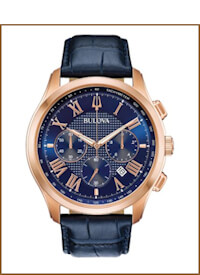 models with oversized chain necklaces embellished with massive gems in all colors.
Key fashion design directions in 2020 include polka dots, two-tone, color blocking, monochromatic combinations, and metallics. Sticks and circles are leading motifs that will dominate. The Futurist cites gem clusters, colorful rainbow pavé, and stacking colors trending design directions.
Beyond gems, pops of color are introduced via colored metal, enamel and Bakelite. In watches, blue is a popular pop in dials and straps (leather, silicone, and polyester). In fact, watchtime.com hails the blue dial/strap combo one of the hottest style trends in the watch world. Bulova offers many examples in sporty, fashion and classic styles where blue is prominent — brand series like the Marine Star, Aerojet, American Clipper, Rubaiyat, Millennia, and Regatta.