Top Spring Colors Convey Hope
After spending 2020 feeling reserved, the New Year promises a fresh outlook.
Spring has always represented the promise of new life and new beginnings, and after the rocky year we’ve just experienced with the likes of a global pandemic, economic upheaval, civil unrest, and polarized politics, expectations for cheerier days ahead are more than welcomed.
The Pantone Color Institute, in its highly anticipated seasonal palette picks, gives us plenty to look forward with grounded and uplifting colors prominent in fashion for spring.
Rejuvenating hues representative of nature topped Pantone’s coveted list: an optimistic yellow called Illuminating, a warm sunny Marigold, a serene Cerulean blue, a mentholated Green Ash, a refreshing Mint, a bright royal French Blue, luscious Raspberry Sorbet, a perfect purple Amethyst Orchid, and a cordial Burnt Coral. Uncharacteristic of a spring palette is earthy Rust brown, emblematic of autumn leaves, an inspiring bridge color across seasons.
Pantone also spotlights five core classic neutrals for the season: a smooth off-white Buttercream, sandy Desert Mist, Ultimate Gray, deep blackened blue Inkwell, and yellow-toned moss called Willow.
“Colors for Spring/Summer 2021 combine a level of comfort and relaxation with sparks of energy that uplift our moods and inspire ingenuity and inventiveness,” describes Leatrice Eiseman, executive director of the Pantone Color Institute. This has been the trajectory since 2016, as Pantone has identified colors hailed as cool, calm, collected, and invigorating.
Pantone just announced its pick for Color of the Year, selecting for 2021 two hues from the spring palette, Ultimate Gray and Illuminating. The New York Times describes the choice as a metaphor for the “light at the end of the tunnel.” Illuminating is a cheerful and vivacious yellow imbued with solar power. Ultimate Gray is emblematic of solid and dependable elements, a firm foundation, Pantone describes.
This is the second time in the 22 years Pantone has chosen a color of the year that it selected two colors. The first time occurred in 2015 when Rose Quartz and Serenity shared the honor. That year, the two shades were meant to blend into each other, reflecting the recognition of gender fluidity and social progress.
 For 2021, the two shades are meant to stand on their own as complementary tones to each other. The choice also marks the first time a gray has earned the title and the second time for a yellow.
Gem Complements
After spending 2020 feeling reserved, a New Year promises a fresh outlook, and jewelry trend trackers are banking on bold, poppy colors and vivid color combinations to be the norm in 2021.
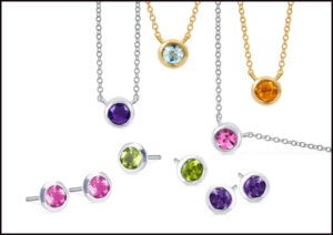
In our COVID-inspired Zoom era, people are seeking to brighten their on-camera look by adorning with splashes of color stones, sees Theresa Namie, merchandise manager for Ostbye, Minneapolis, Minnesota, especially earrings and necklaces. Among the most popular gemstones are aquamarine, amethyst, and garnet, which she describes as colors that please the eye, work well together, and translate organically to the earth for deeper significance.
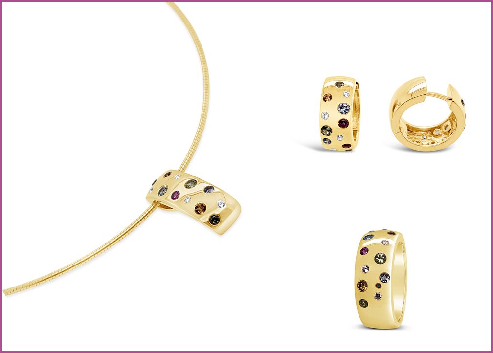
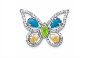
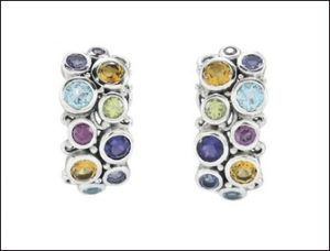
The brightness of the spring palette really lends itself well to gorgeous gemstone jewels in vibrant mixes, as conveyed in the collection of New York designer Samuel Behnam for Samuel B. His latest designs are joyful mosaics of different shapes and sizes of bezel-set gems like amethyst, citrine, apatite, peridot, rhodolite, and blue topaz.
Cora Lee Colaizzi, marketing director and senior merchandiser for Quality Gold, Fairfield, Ohio, also finds multicolored jewelry trending. “Combinations of blues, greens, and purples, as well as broader combinations, which some refer to these as ‘rainbow’ style are popular.”
Colaizzi referenced QG’s colorful silver and CZ collection, Prizma, a bestseller for its price points and classic line-style necklaces and bracelets, hoop earrings and band rings, gem station chain necklaces and bracelets, and dangle earrings mixing gems, shapes and settings. Favorite stones in the mix include citrine, amethyst, peridot, and blue topaz, as well as ruby, emerald, sapphire, and diamond. Turquoise, lapis, and rose quartz also pair well in this palette.
Reflections
A lot of designers are reflecting back on designs from the 1980s, Namie notes. “Bold gold and silver with a dash of color but not quite as neon as the ‘80s. You will also see color in floral designs that are trending from last year, geometric patterns, and link chain designs, of which the paperclip chain is the most popular. It’s a bit like Modern Sleek meets Boho fashion. Most of these styles will be reflected in collar length pendants and drop earrings for the best look from the waist up.”
Allison Peck of Brevani says the New York-based brand, a subsidiary of Color Merchant, is thrilled to see hues of blue and purple prominent in Pantone Spring 2021 palette.
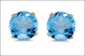
“Amethyst and blue topaz have always been strong sellers for us, so this is something we as jewelers should play up, which gets consumers excited,” Peck says. “Going forward, it is only validation that blue topaz and amethyst will be favorites this season!”
Malia Villanueva for Breuning USA in Lawrenceville, Georgia, is finding the same. “One of the most popular combinations we’ve seen this year is blue topaz and amethyst. We have several pieces in our newest line with this combination, as well as blue topaz and garnet. We expect to see a lot of two-tone yellow and white with blue topaz in the coming season.”


