


Blues & Greens Top Spring Palette
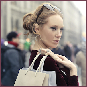
Spring 2017 will see a continuation of blues and greens dominating the fashion color palette. The Pantone fashion color report lists five blues and greens among the top 10 most popular shades in ready-to-wear collections for the season. In fact, the fresh, springtime hue named “Greenery” is Color of the Year.
 Bright and vivid to lush and earthy, the palette reflects a mix of vitality, relaxation and the great outdoors, says Leatrice Eiseman, executive director of the Pantone Color Institute. She says the continued surge in popularity for blue shows that people are still seeking calm and stability, while interest in greens reflect our desire to renew and reconnect with nature, one another and a larger purpose.
Blue remains a key color with the latest shades Niagara, a classic denim-like blue; Lapis, a deeper blue; and Island Paradise, an aqua-inspired blue. Melding into refreshing foliage-based greens are Kale and Greenery, perfect backdrops to both vibrant and pastel tones. Color of 2017, Greenery is a springy yellow-green symbolic of new beginnings. Eiseman describes it as a “trans-seasonal” shade.
The spring palette also features Pink Yarrow, a festive, tropical version of Rose Quartz; Flame, a fiery red-based orange; and sunny, happy Primrose Yellow; as well as perfect transitional neutrals in Pale Dogwood, a demure pink shade with a healthy glow, and Hazelnut, a warm muted brown reflecting natural earthiness.
Gem Picks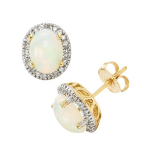
“As color trends are harmoniously shared between fashion and jewelry, it is beneficial for the jewelry industry to be aware of the season’s trending palettes,” advises Eiseman. “Given these are the most popular shades on the runways for the upcoming season, jewelers can take notes in the creation of their new pieces, to ensure they will complement the colors their consumers will be wearing.”
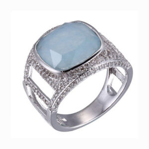
A bevy of gem choices in a range of prices can be found in blue and green, says Amanda Gizzi, director of public relations and special events for Jewelers of America. Many of these gems were well represented in designs at JA’s Annual Fine Jewelry Preview in New York last September like sapphire, aquamarine, turquoise, and topaz; emerald, tsavorite, green onyx and tourmaline.
“We’re especially in love with green stones,” hails Maureen McIntyre, vice president of merchandise for color gemstones and pearls, Richline, New York. “Green tourmaline, and now peridot is the perfect match to Pantone’s Color of the Year. We also see a lift in sales with London Blue topaz. We always do well with topaz and adding London Blue gives us more options. We’re getting a lot of positive feedback on anything floral, and these colors are perfect for this trend.”
 McIntyre also cites Ethiopian opal a standout for Richline. In fact, Eddie Weiss with EMA Jewelry, New York hails it the hottest gem on the market: “Ethiopian opal is a phenomenal stone. There’s so much light in it; it goes with everything; and it’s a natural gem that’s affordable. There’s good quality material in larger sizes and for good prices. Customers love it, especially in yellow and rose gold.”
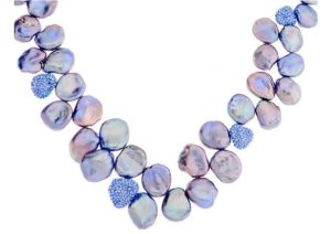
Gems offer many opportunities to create something fun, affordable, of good value and wearable, and that’s what women want says designer Sara Blaine, a Benchmark partner in Atlanta. Her latest designs feature green and blue gems like aqua chalcedony, chrysoprase, turquoise, topaz and iolite. She also cites pearls a must-have. “Everyone loves pearls; there’s so much you can do with them, fun in colors and shapes. I can’t remember a year I didn’t use pearls.”
Gizzi concurs, citing pearl brands including Imperial, Mastoloni and Honora showed pieces at JA’s Jewelry Preview set with different pearl types and colors in innovative designs like earrings with gem jacket, front-back and threader styles; bold, openwork rings and cuff bracelets; and mixed with other stones.
Key color stories in 2017 reflect an evolution of the popular 2016 Colors of the Year Serenity and Rose Quartz, cites Lori Kluempke, senior vice president for Prime Art & Jewel. The Dallas-based manufacturer translates the trend in two collections: Colors of the Dawn with blue chalcedony, aquamarine, blue topaz, and rose quartz; and Rose Gold Blush with morganite and rose quartz.
Weiss concurs that the continuing popularity of rose gold keeps morganite a favorite, and has become a bridal gem alternative. In fact, Gizzi cites earth tone stones trending like champagne and cognac diamonds, brown zircon, and smoky topaz and quartz as designers play with alloys that are warmer and earthy.
Perhaps, the biggest trend in color is the use of vibrant mixes like red and pink with orange, or blue and green with purple, says Gizzi. Eiseman describes the color synergy between the shades “inspiring a renewed sense of imagination in playful, yet thoughtful combinations that tell the story of our global culture”.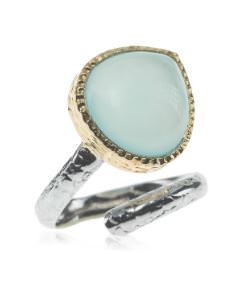
The Internet and social media have widened our view of color, concurs stylist to the stars Michael O’Connor, sharing never-thought-of-that combinations that are fresh and exciting. “There’s an old saying: blue and green should never be seen, but it’s the hottest combination today.” He cites more synergy in the palettes, allowing wardrobes to evolve in color to be more transitional and season-less.