How to Optimize Social Content for Mobile-First
Did you know 80% of social media users rely exclusively on a mobile device? Is your social content meeting the needs of today’s mobile-only consumers?
In this article, you’ll discover why and how to optimize your content for a mobile-first audience on social media.
Why Marketers Should Prioritize Mobile-First Content
No matter your industry or audience, creating mobile-first social media content is more important than ever. In 2023, 99% of social media users (nearly 4.5 billion people) access their social networks of choice with smartphones. Although some also use desktop computers to check social media, nearly 80% rely exclusively on a mobile device.
If you aren’t optimizing social media content for mobile users, there’s a good chance that you aren’t maximizing results for your account. After all, if your content doesn’t resonate with mobile users, it might not get much engagement. If followers regularly scroll right past your content, they’ll be less likely to see it in the feed in the future.
Without engagement, your content won’t trigger any popularity signals. On networks like Facebook, Instagram, and YouTube, content that generates comments and reactions is more likely to appear in followers’ feeds and be recommended to non-followers. In other words, good mobile-optimized content can improve your results dramatically.
It’s easy to dismiss a mobile-first social media content strategy as something that’s strictly “for the algorithm.” But it’s more helpful to think of it as a way to reach and engage your target audience more reliably. Naturally, your audience is more likely to want content they can easily consume on mobile devices.
When planning social media content for your business, you can optimize both the copy and the creative. Below, we’ll look at tactics for captions, images, videos, and stories that apply across all social media networks.
#1: How to Optimize Social Media Captions for Mobile
To write social media copy that grabs mobile users’ attention, make it easy to skim.
Watch for the See More Link in Captions
Most social media captions can support hundreds or thousands of characters, giving your team plenty of space to work with. There’s no definitive answer on whether shorter or longer captions work best on mobile, as the context, audience, and industry all affect what’s ideal for a specific post.
Whether your organization errs on the side of longer or shorter captions, it’s important to remember that every social network truncates captions after a certain character count. The See More link appears automatically at a different point for each network. On Facebook, it’s at about 140 characters.
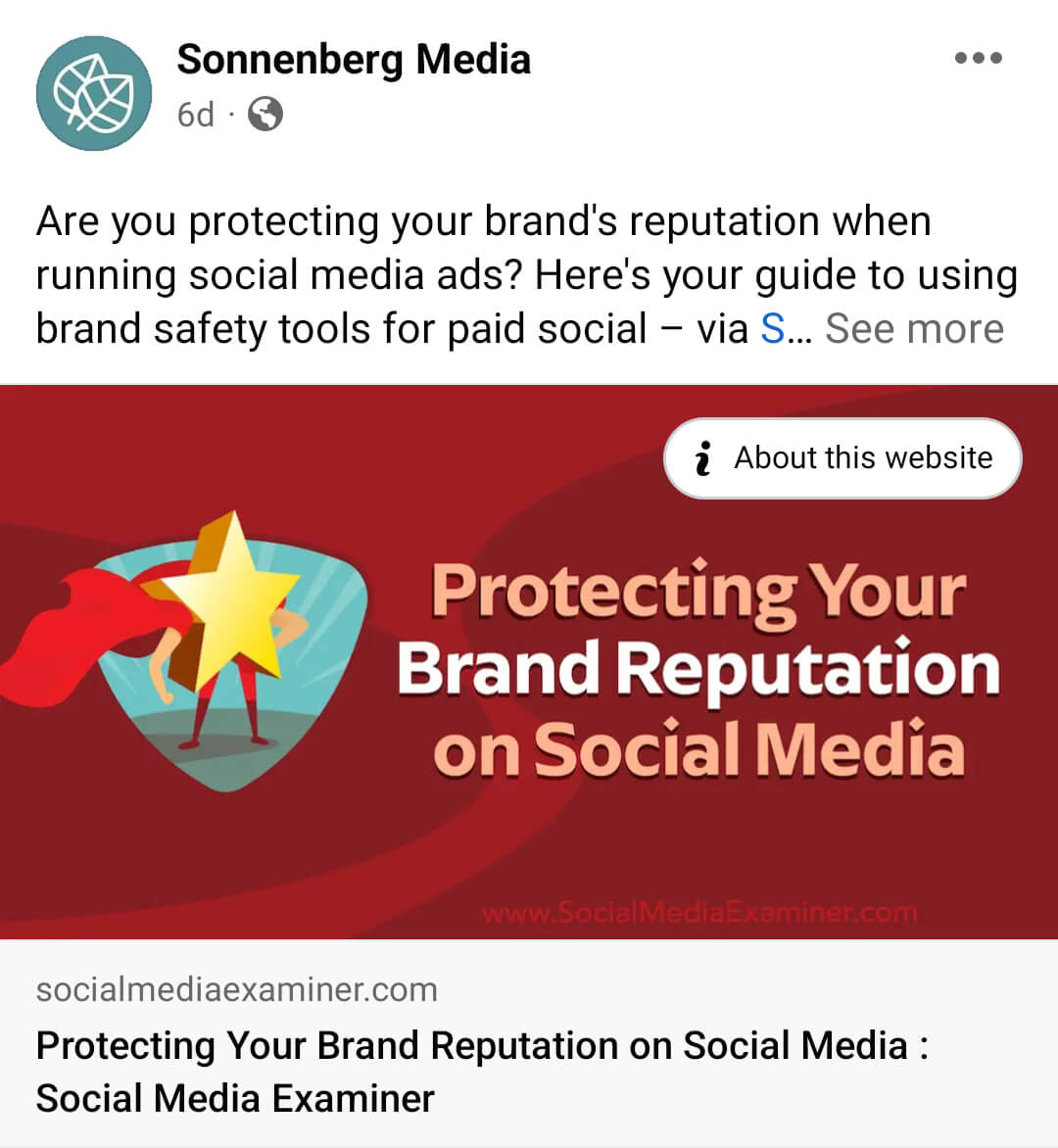
On LinkedIn, the limit is closer to 100 characters. Keep in mind that these posts reflect the mobile app limit, which is often shorter than what displays on desktop.

On Instagram, the caption limit depends on where the content appears. The character count in the main feed (left) is much longer than what shows in the Reels feed (right).
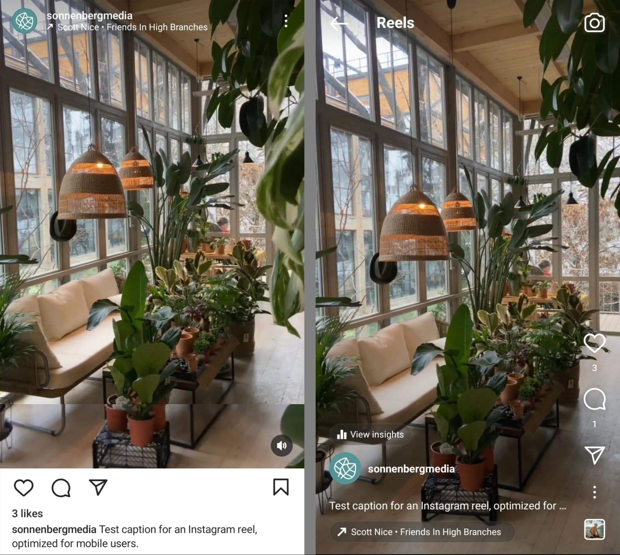
One option for optimizing captions is keeping them as short as possible, ideally under the limits above. That way, users can read the entire caption without having to tap the See More link.
But concise captions aren’t always ideal or possible. When you do write longer captions, make sure to include a hook before the copy gets truncated. Give users a reason to want to know more so they’ll be more likely to engage.
Write Skimmable Captions
If you write longer captions, make them easy for mobile users to read quickly. A good rule of thumb is to make captions scannable. You can do that by avoiding seas of text and adding line breaks after every sentence or thought.
Although inserting emojis can add visual interest to posts and may make them stand out in the mobile feed, this approach compromises accessibility. Instead, line breaks tend to work best for balancing accessibility with readability.
Create Catchy Titles for Mobile Videos
In some cases, titles are more important than captions for mobile-optimized videos. For example, only titles show (left) when viewers watch YouTube shorts. Captions don’t display at all unless users tap to view the description box (right).
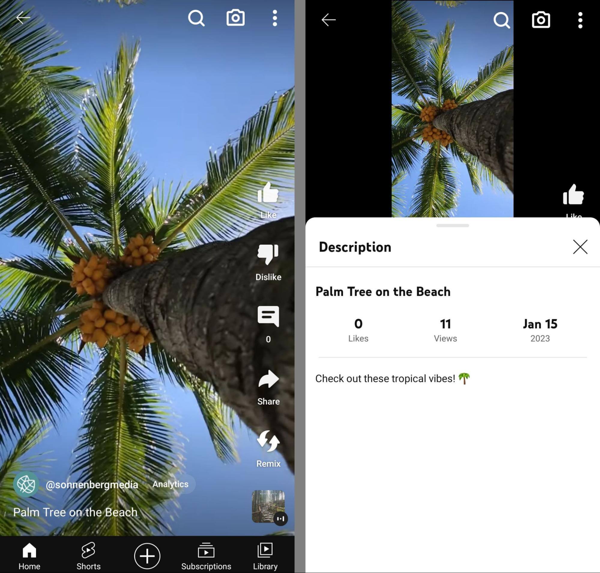
To make your short-form video titles more compelling, keep them as short as possible (i.e., fewer than 100 characters) while incorporating a hook. Create titles that users can easily relate to or that provide helpful context by quickly summing up the topic.
#2: How to Design Mobile-First Social Media Images
To optimize social media images for mobile, create content that stands out and maximizes vertical real estate.
Aim for Square or Portrait Aspect Ratios
For years, most social media networks have recommended publishing images with landscape aspect ratios. Usually, that means 1200 x 627 pixels or something similar. Although Facebook, LinkedIn, and other social networks still support landscape images, this aspect ratio isn’t ideal for mobile users.
Because they’re wider than they are tall, landscape images take up minimal space in the mobile feed. The mobile feed is optimized for vertical images, which means landscape images may not stand out or capture attention as effectively. Updating the aspect ratio is an easy solution.
Both square (1080 x 1080 pixels) and portrait (1080 x 1350 pixels) aspect ratios work well in mobile feeds on all social networks. So which is the best choice? Portrait images take up the most vertical space in the feed, which means they’re more likely to stand out and get attention.
But that doesn’t mean square images are a bad option for mobile users. They’re certainly better than landscape images. And if you’re repurposing landscape images that you already had on file, it’s often easier to rework them into a square image than into a portrait aspect ratio.
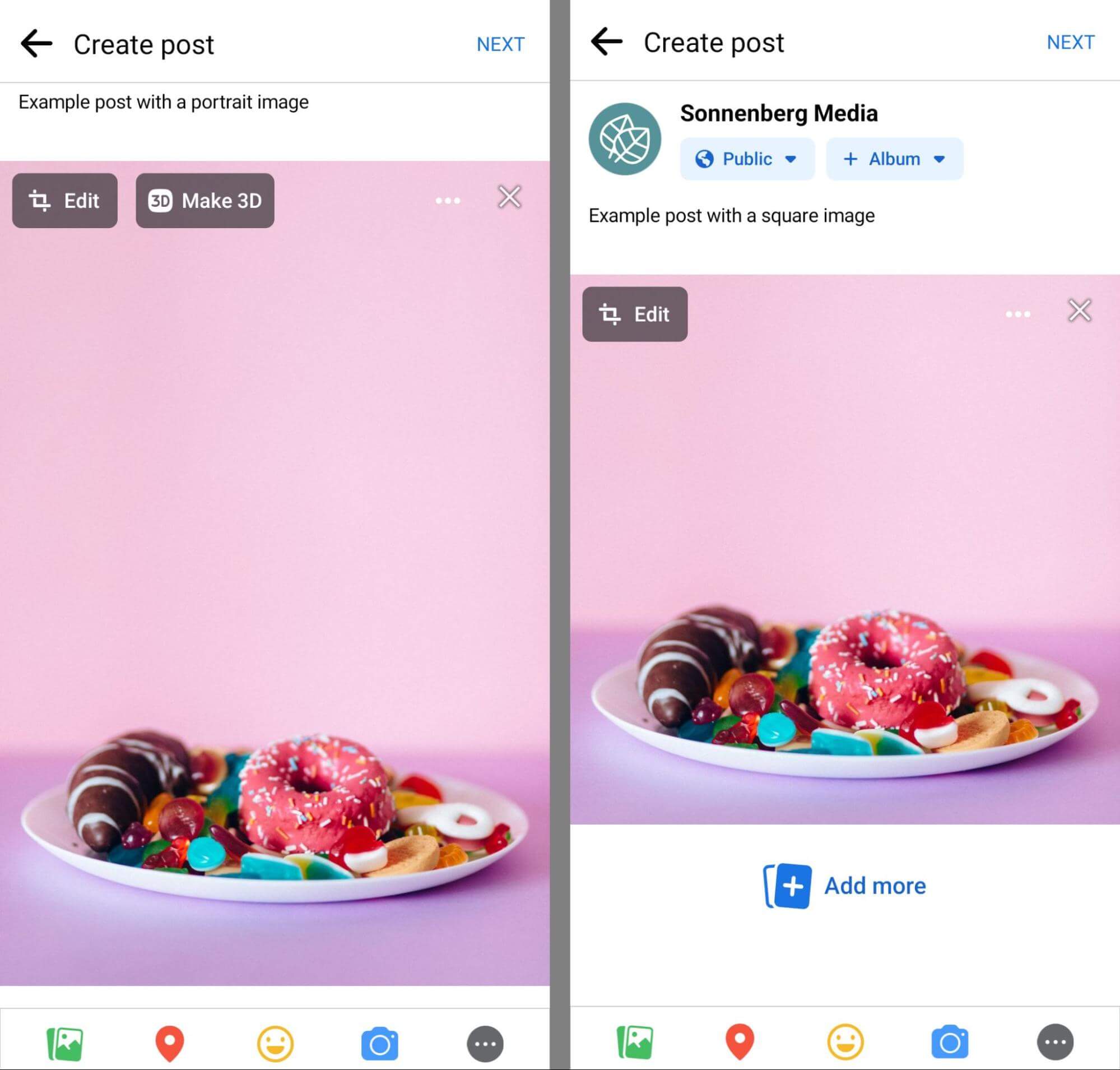
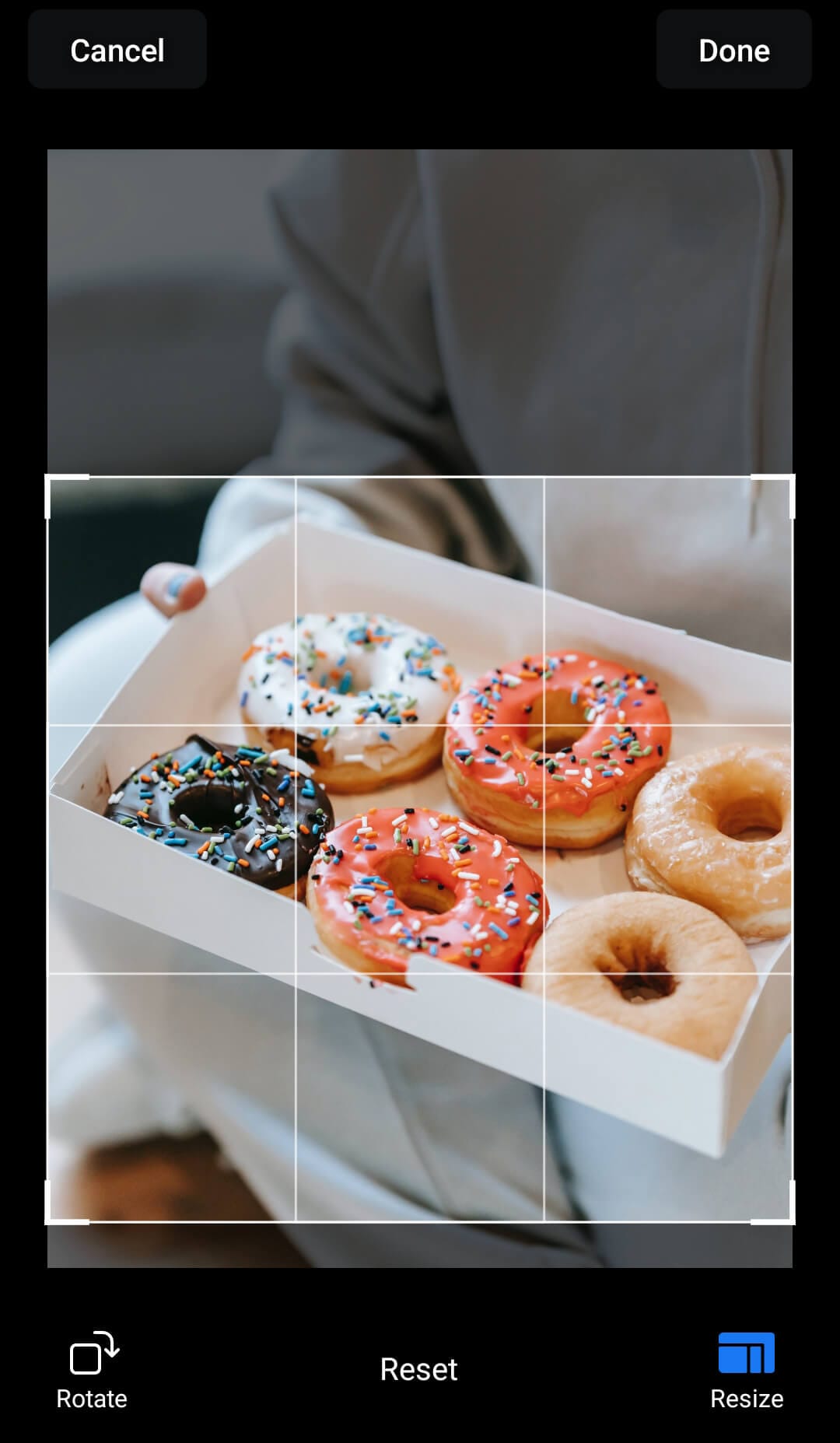
In most cases, you don’t even need to edit your images in a third-party app. Instead, you can crop them directly in the social media app as you create your post. For example, Facebook allows aspect ratio adjustments and image repositioning via the Edit button in the upper-left corner.
Use Consistent Sizing for Carousels
When a single image doesn’t communicate everything you want to say, carousels are ideal for sharing multiple images (or a mix of images and videos) at once. Even better, carousels are great for mobile since they encourage users to swipe through and view all of the creatives.
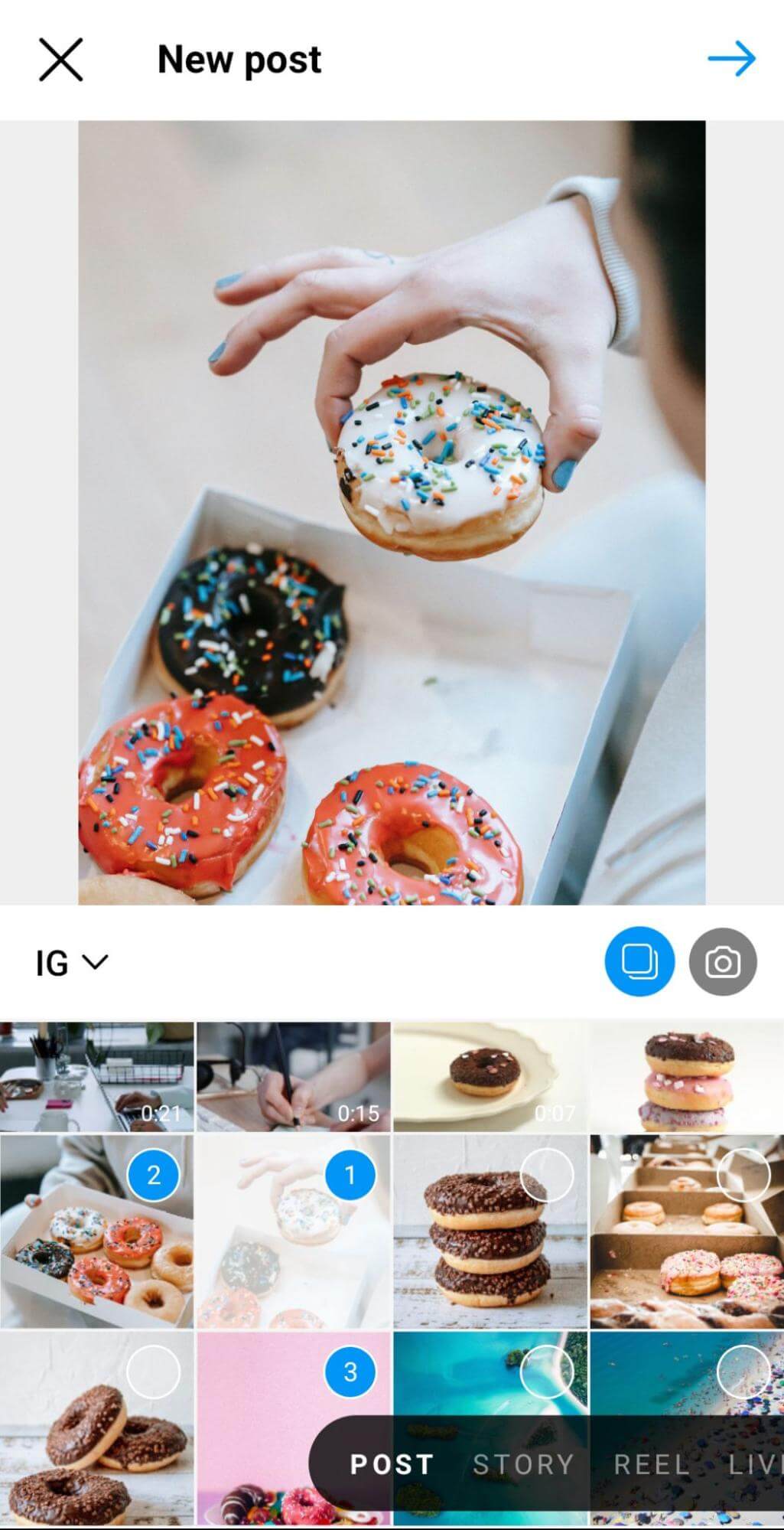
On Instagram, you can include up to 10 images, videos, or a mix of both in a single carousel. Whether you’re planning to use square or portrait images, it’s important to choose one aspect ratio. If you add images with multiple aspect ratios, Instagram will automatically publish all of them as squares.
Keep in mind that uploading multiple images works differently on each social network. On Instagram, multiple images display as an interactive carousel, which is ideal for mobile. On platforms like X and Facebook, multiple images display in a grid format, which isn’t as intuitive to navigate.
Consider Posting Images Instead of Links
If your business shares a lot of external resources on platforms like X and LinkedIn, it’s worth rethinking how you share them. When you add a link to a post, most social media networks create what’s known as a link preview. This interactive element gets attached to your post and displays the external page’s title and featured image automatically.
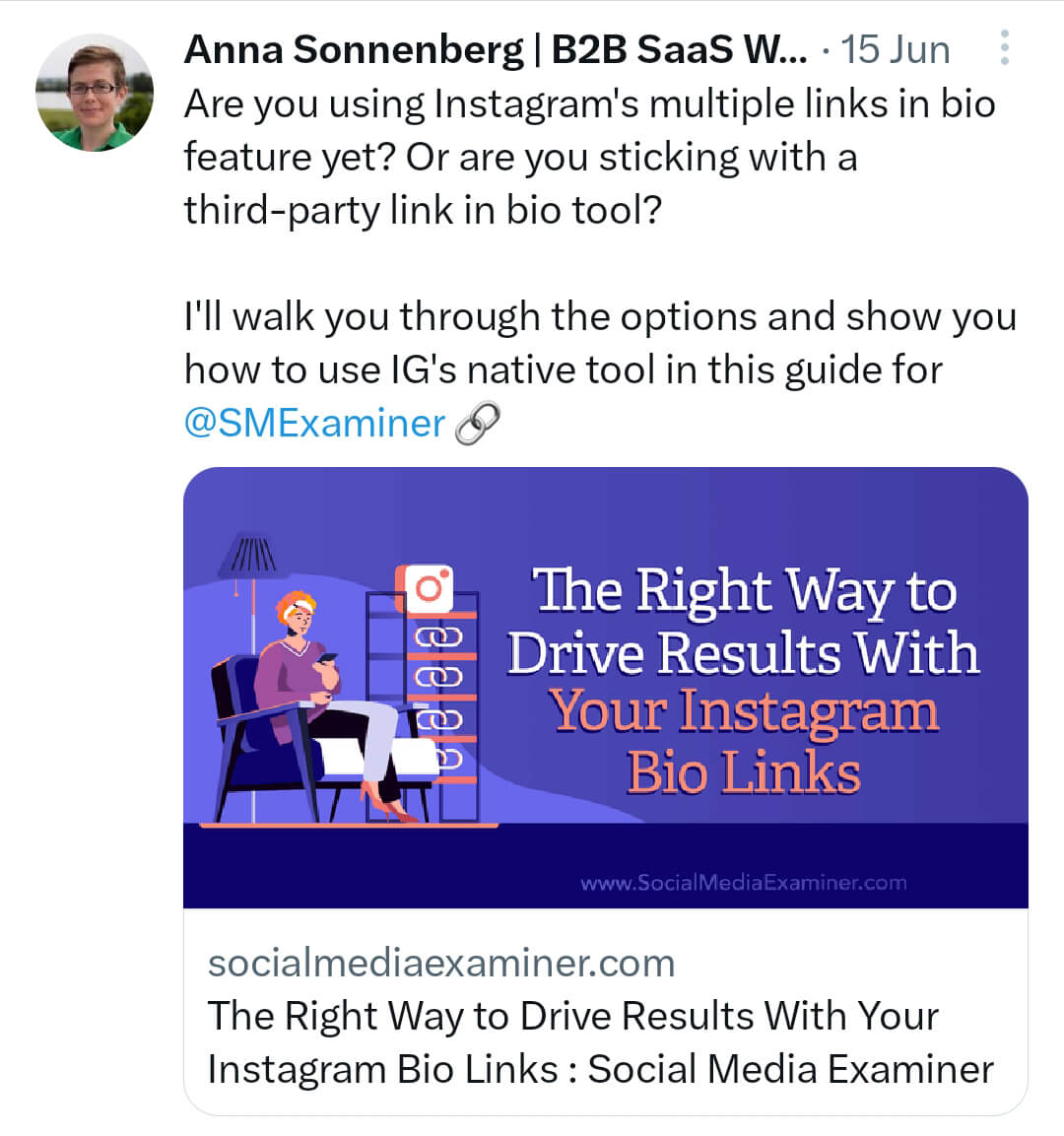
Link previews are easy for social media users to click and they give you a handy way to show information from external sites. Yet they aren’t usually optimized for mobile feeds. Link previews often show landscape images, which don’t maximize vertical space in the feed.
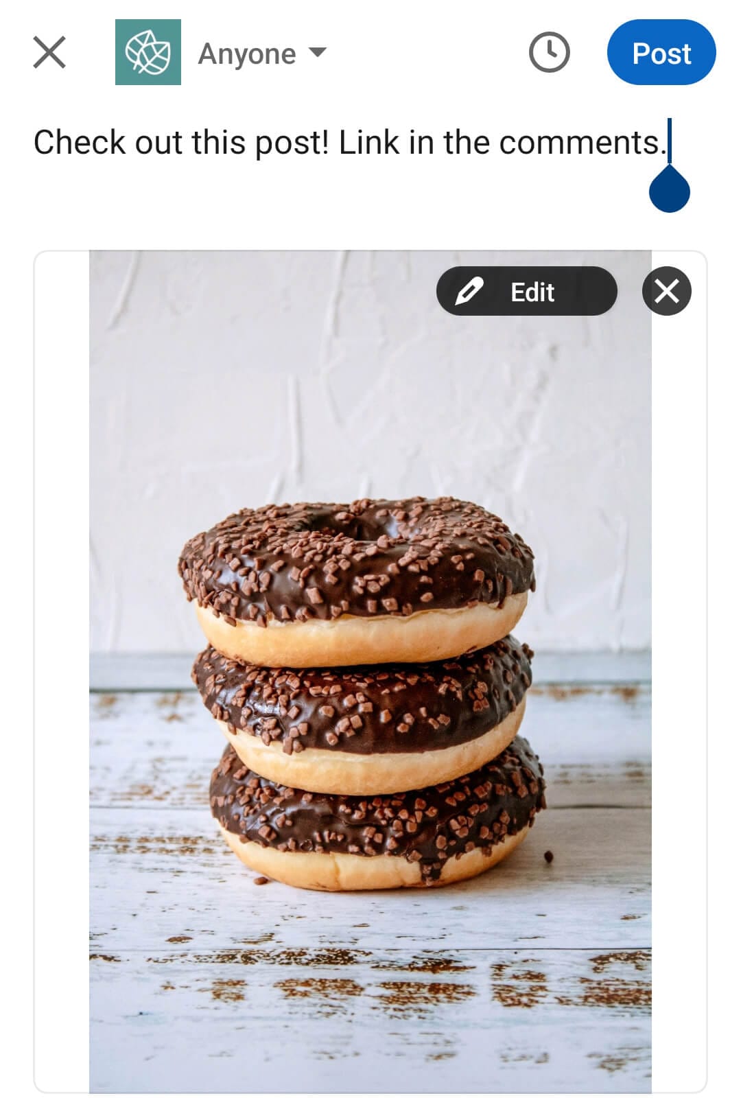
Although you can’t replace the images that automatically display in link previews, you can prevent them from showing at all. When you share a link, consider uploading an image to the post. The URL will still display in the caption, but a link preview won’t appear.
Alternatively, consider eliminating URLs from post captions altogether. It’s worth testing them in the comments rather than in the post itself, as captions with external URLs can have lower reach.
#3: Tips for Producing Mobile-First Videos
To optimize social media videos for mobile, consider aspect ratios, sound, and on-screen elements.
Prioritize Vertical Videos
Like images, videos work best on mobile when they take up as much vertical real estate as possible. But the specifics are a little different for each platform:
- Facebook supports both feed videos and reels. It’s often a good idea to include both types of video content in your Facebook strategy, as portrait (4:5) feed videos and vertical (9:16) reels serve different purposes.
- Instagram no longer supports feed videos so all video content publishes as reels. Since any video content will be automatically uploaded in this format, it’s best to create 9:16 videos.
- LinkedIn supports 9:16 videos but they don’t yet seem to be the norm for this network. I recommend testing both 4:5 and 9:16 videos to see which works best for your audience.
- TikTok publishes all videos in 9:16 format so optimize for this vertical aspect ratio.
- X supports both 4:5 and 9:16 videos but doesn’t have a dedicated feed for the latter. Vertical videos aren’t the norm on X, which automatically crops them in the feed. It’s a good idea to test video aspect ratios to see what works for your X audience.
- YouTube publishes all short-form videos in 9:16 format so it’s important to optimize your videos for this aspect ratio.
If you’re planning to publish video content across multiple social networks, using a 9:16 aspect ratio is a good bet. All networks support this format and you can crop it to fit a 4:5 aspect ratio for select placements.
Insert Text Overlays
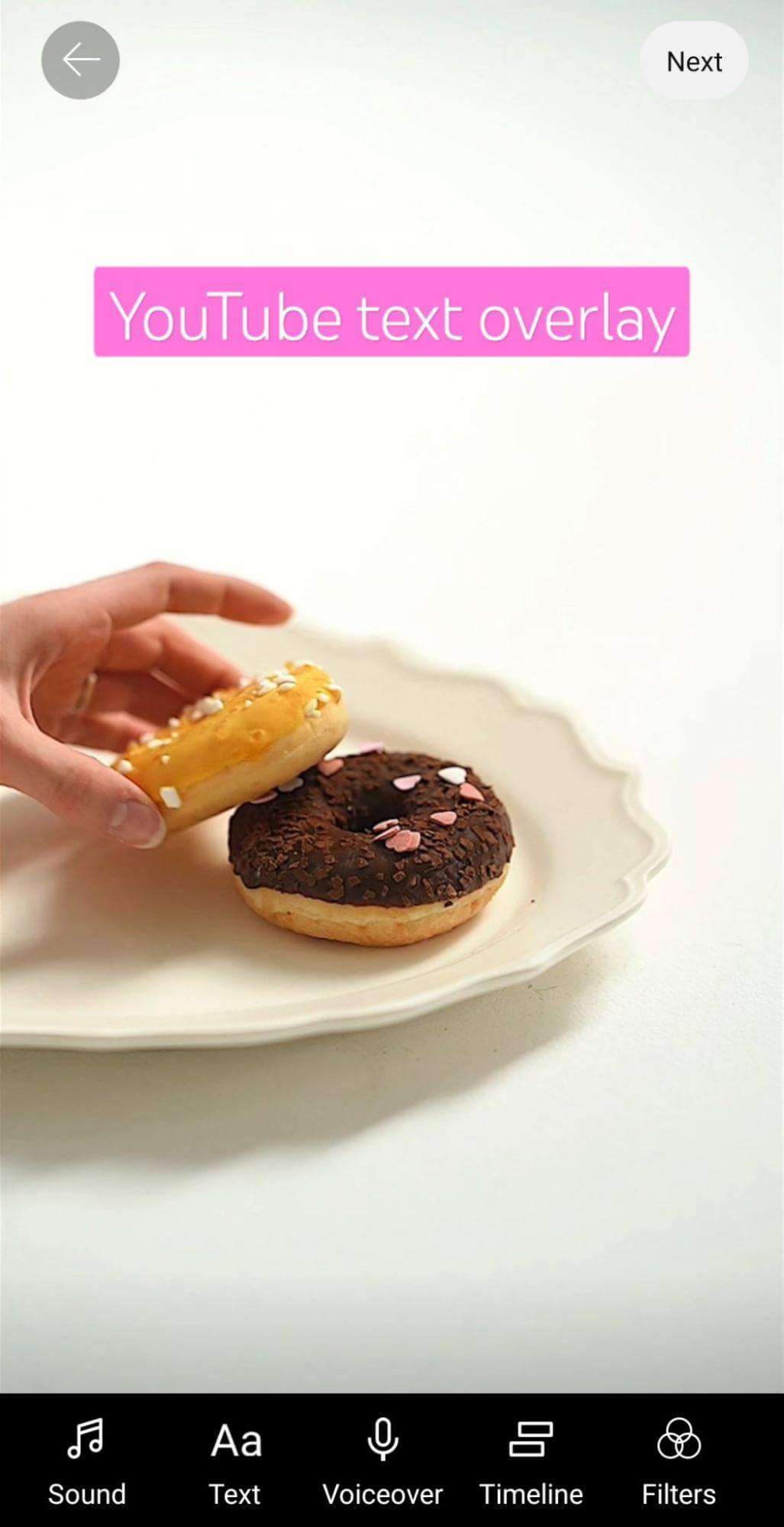
Text overlays can help video content stand out in the feed. Whether viewers are watching with or without sound, text overlays provide extra information that can capture attention and encourage engagement.
When you publish 4:5 videos, you’ll typically need to add text overlays in a third-party video editing app before posting. But when you publish 9:16 videos to platforms like Facebook, Instagram, TikTok, and YouTube, you can add them directly in the app. Adding text in-app can be time-consuming if you’re planning to publish the video to multiple social networks. But I find that videos with more native elements—including text overlays, effects, and transitions—typically perform best.
Add Sound and Captions
Sound is more important than ever for mobile-optimized videos, especially if you’re posting 9:16 content to a social network with a dedicated vertical video feed. Sound is considered standard for reels, shorts, and TikTok videos, so content that doesn’t include sound is likely to stand out—not necessarily in a good way.
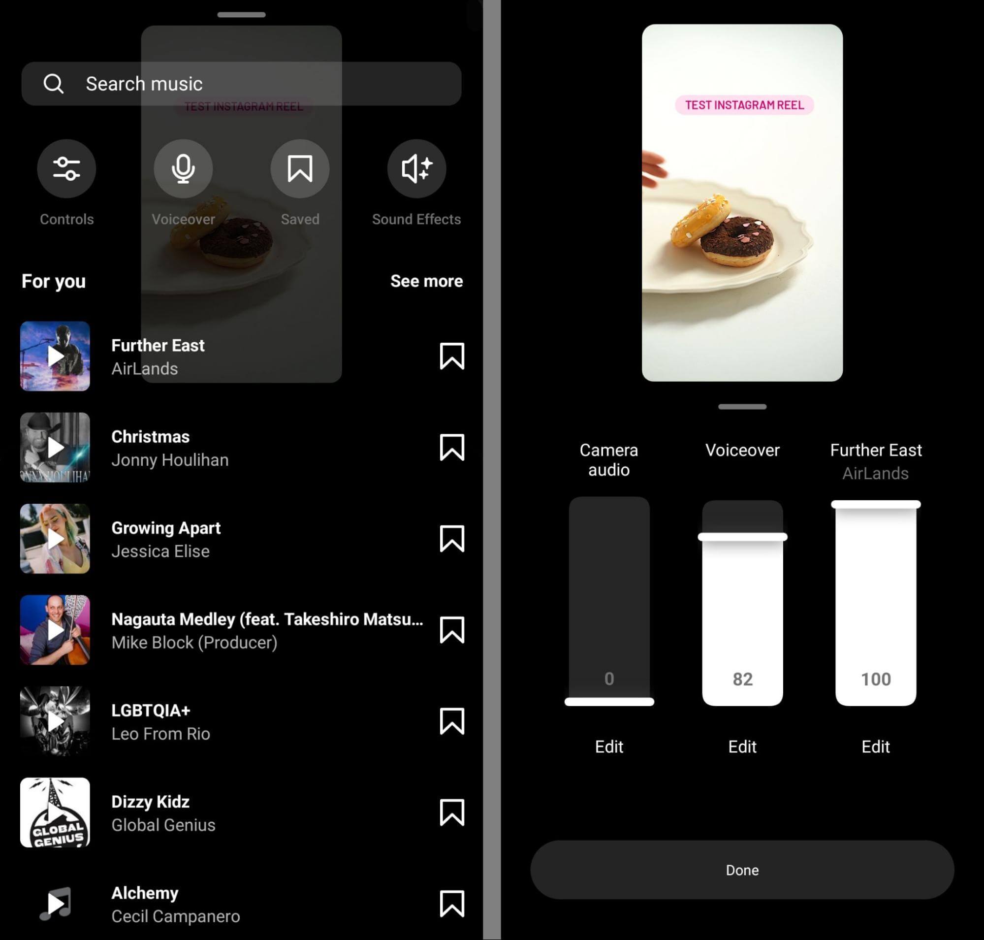
When you create vertical videos in these native apps, you can easily record voiceovers and mix them with original sound. To add another layer of sound, you can choose royalty-free music from each network’s library.
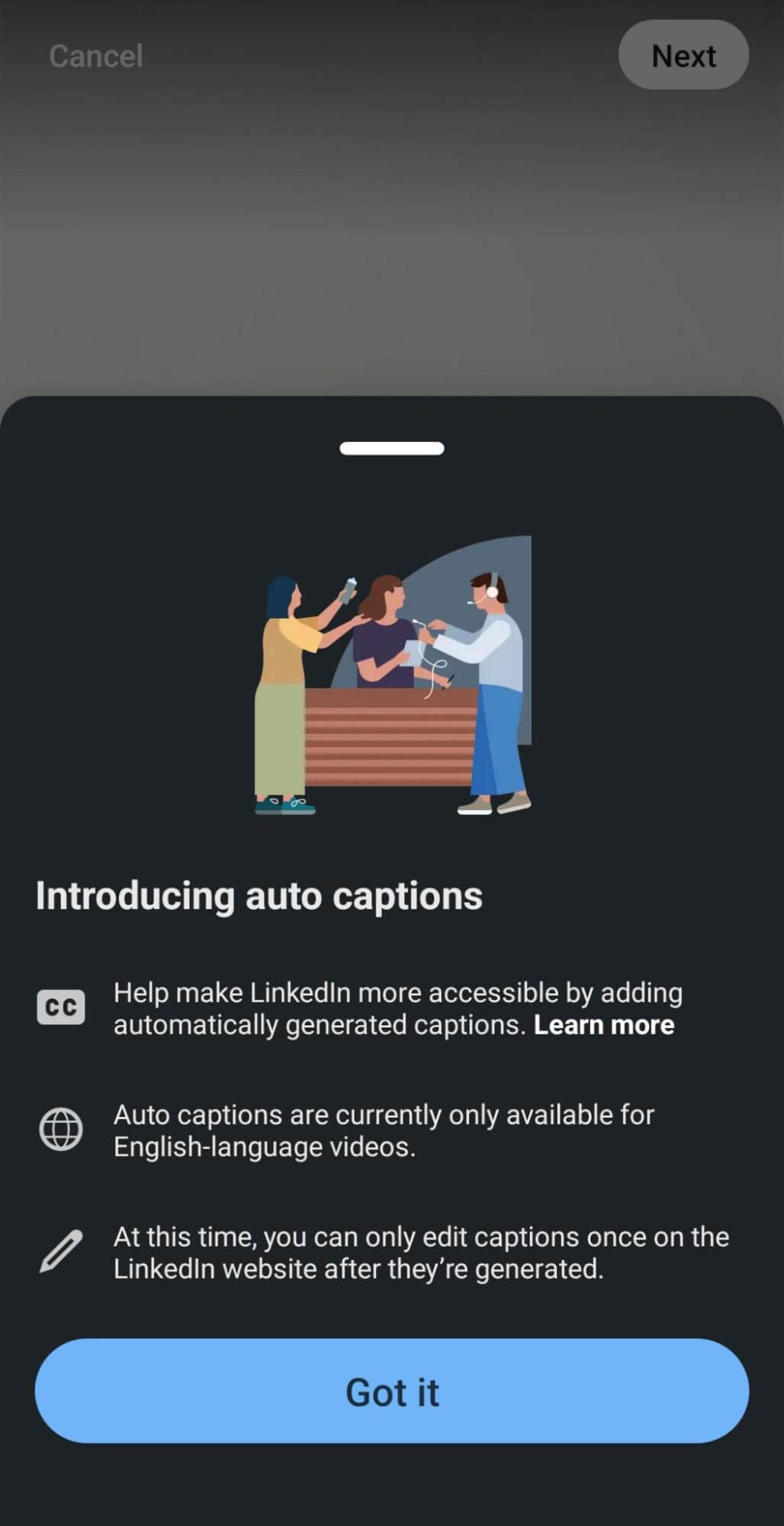
If your videos include dialog or voiceovers, make sure to add subtitles or captions to make the content easier to understand. With Instagram, you can add captions using the app’s caption sticker. LinkedIn (below) creates subtitles automatically.
Use Interactive Elements
Ideally, viewers are doing more than just watching your videos and scrolling past. Interactive elements can make it easy for viewers to engage on select social media networks—especially when paired with a great video and a relatable caption.
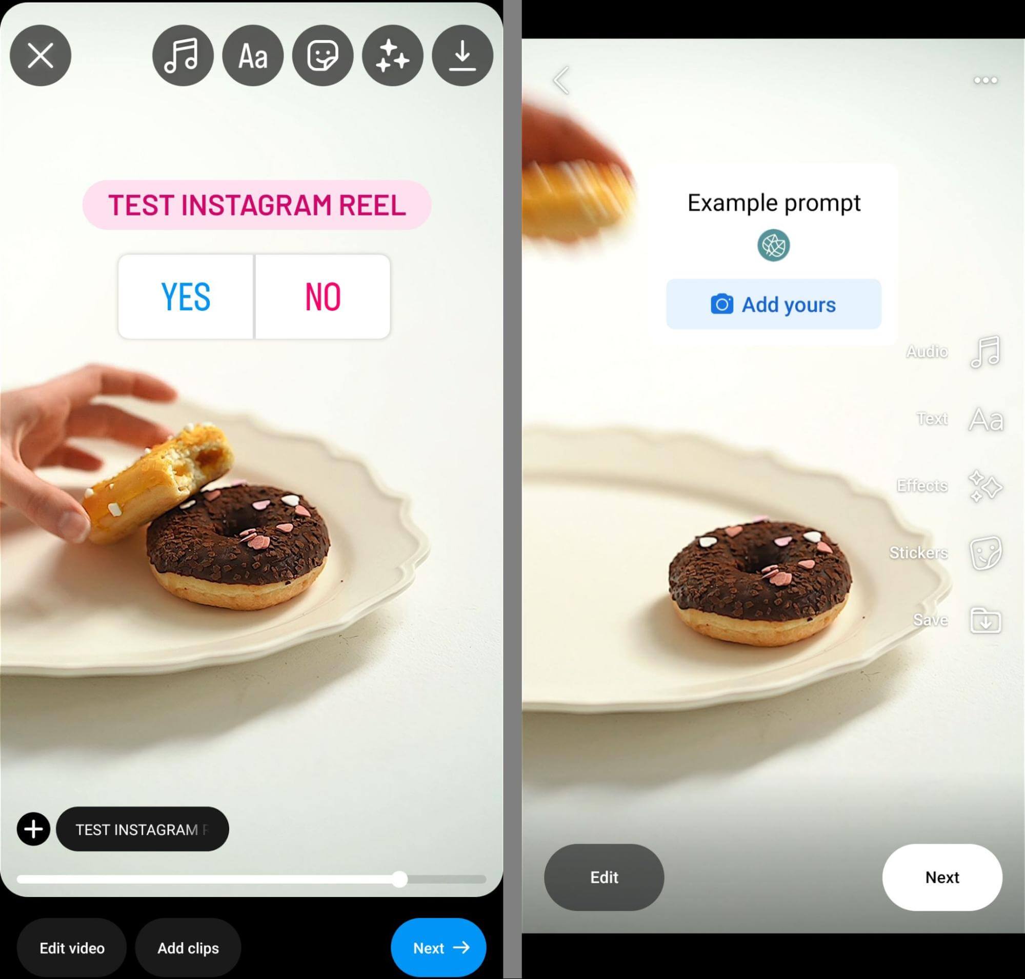
For example, Instagram has poll and quiz stickers (left) that let viewers weigh in on simple questions. Instagram and Facebook have the add yours sticker (right), which encourages viewers to contribute their own content to a theme.
#4: How to Create Mobile-Optimized Stories
Stories are a type of mobile-first content so it’s easy to assume that any you publish will be optimized for mobile. However, that isn’t always the case, especially if you tend to produce and schedule stories on desktop.
Creating stories on desktop might be a better fit with your workflow and scheduling stories can allow you to batch content creation, which can save a ton of time.
Yet most time-saving tools and tactics for Stories eliminate any options for optimizing this type of content. Stories tend to work best when they’re engaging and interactive. That typically means it’s in your best interest to create them directly in the Instagram app, where you can add native elements.
For example, you can add native text overlays that provide context and prompt followers to reply. You can also add tappable elements like emoji sliders, polls, and mentions. For ecommerce or external resources, you can add link stickers or product tags.
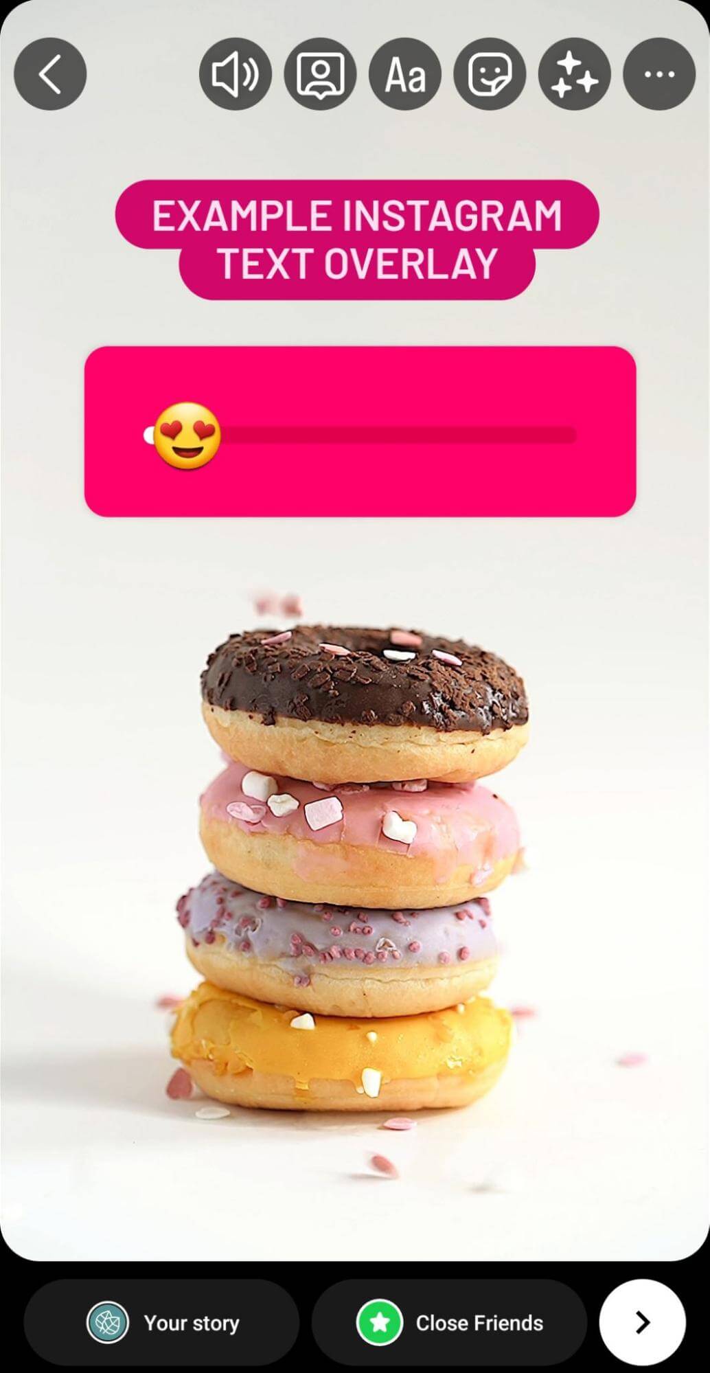
Which elements are likely to work best for stories? In my experience, it depends on the industry and audience. Experiment with low-effort stickers like emoji sliders and polls to see if your audience engages. Then test elements that require more time and thought, like question and add yours stickers, to see what resonates with your followers.
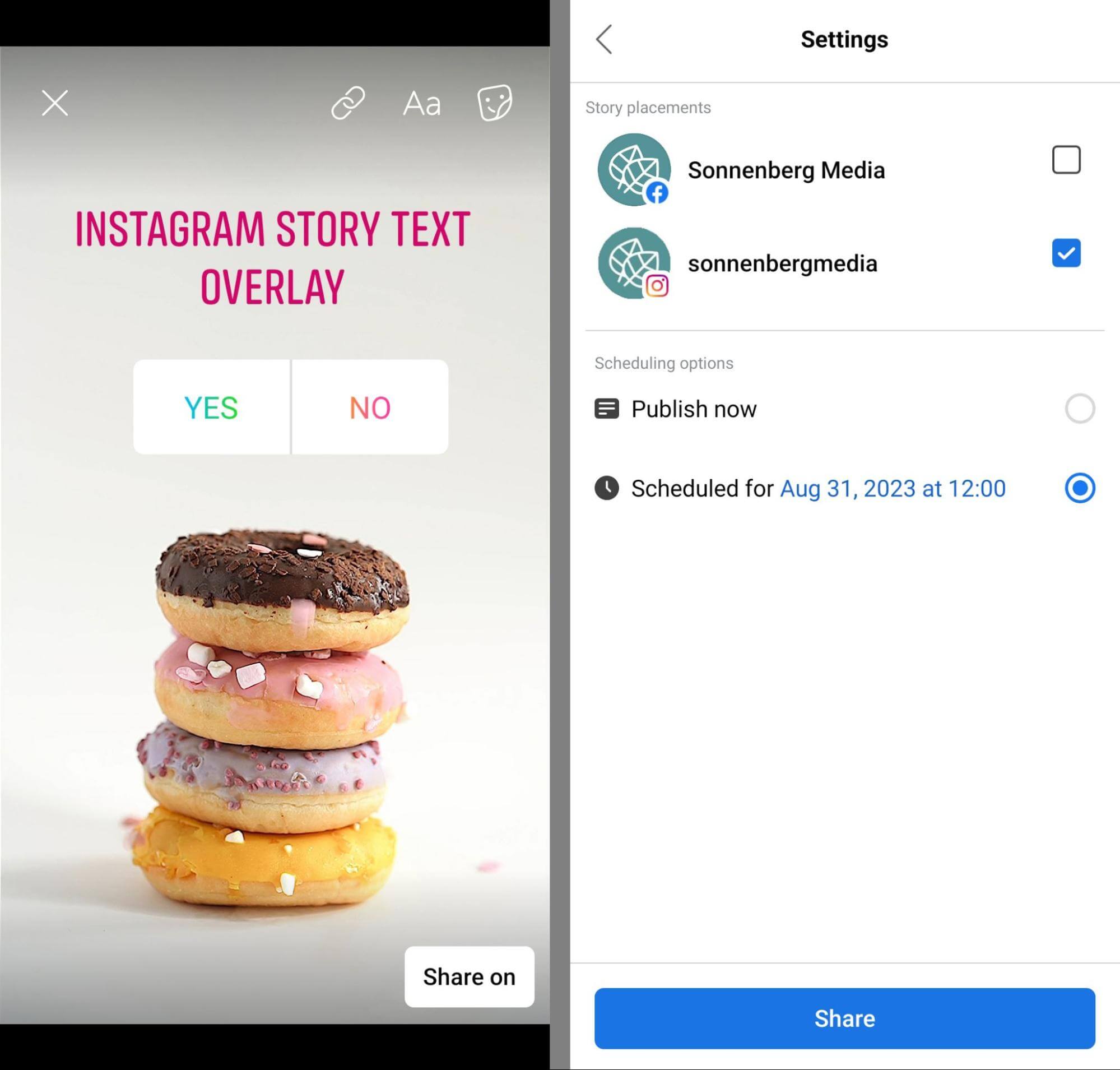
In some cases, you might consider scheduling stories in the Business Suite app. You won’t see the full slate of interactive stickers here but you can add text overlays and choose from a handful of options like poll and mention stickers.
Conclusion
Creating mobile-optimized social media posts and stories should be a top priority for marketers in virtually every industry. Using the tips above, you can make mobile-first copy and creatives an essential part of your social media content workflow.
Source: Social Media Examiner