WGSN Chooses Sapphire Shade as 2027 Color of the Year
WGSN 2027 Color of the Year is Luminous Blue
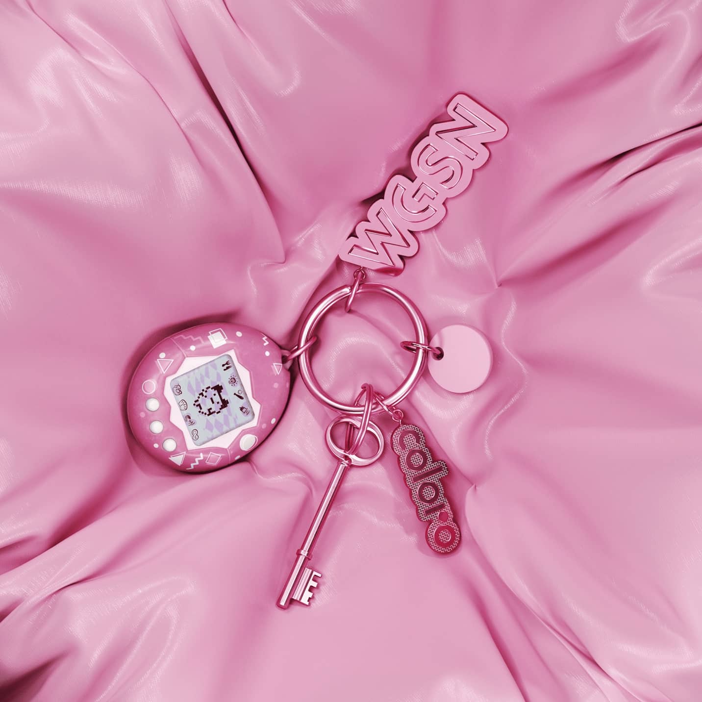
WGSN, the world’s leading consumer trend forecaster, and Coloro, the leader in color excellence, have revealed Luminous Blue as the Color of the Year for 2027. The companies also unveil the five Key Colors for S/S 27.
Interconnectedness will be a defining theme going into 2027, driving the Key Color selection for S/S 27. There will be interconnections between polarities: lightness and darkness, nature and technology, ancient and contemporary, online and offline, rationality and spirituality. Interconnectedness in color will allow palettes to balance functionality, practicality and innovation with contrary themes of amusement, spirituality and emotion.
Growing interest in color and emotion will give rise to colors that provide a sensory link to tradition, culture and wisdom, which can feel both grounding and resilient. These earthy pigments will also be inspired by the search for purpose and meaningful connection to community and nature, as people continue to be overwhelmed by the pressures of a polycrisis in 2027.
Playful and joyful hues will be vital for S/S 27, and will be used as a coping mechanism to rise above the stresses of the world.
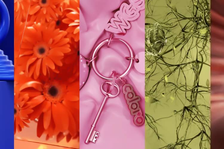
Selected from Coloro’s library of 3,500+ hues, the Key Colors for S/S 27 are Luminous Blue, Energy Orange, Pop Pink, Meadowland Green and Clay.
2027 Color of the Year: Luminous Blue
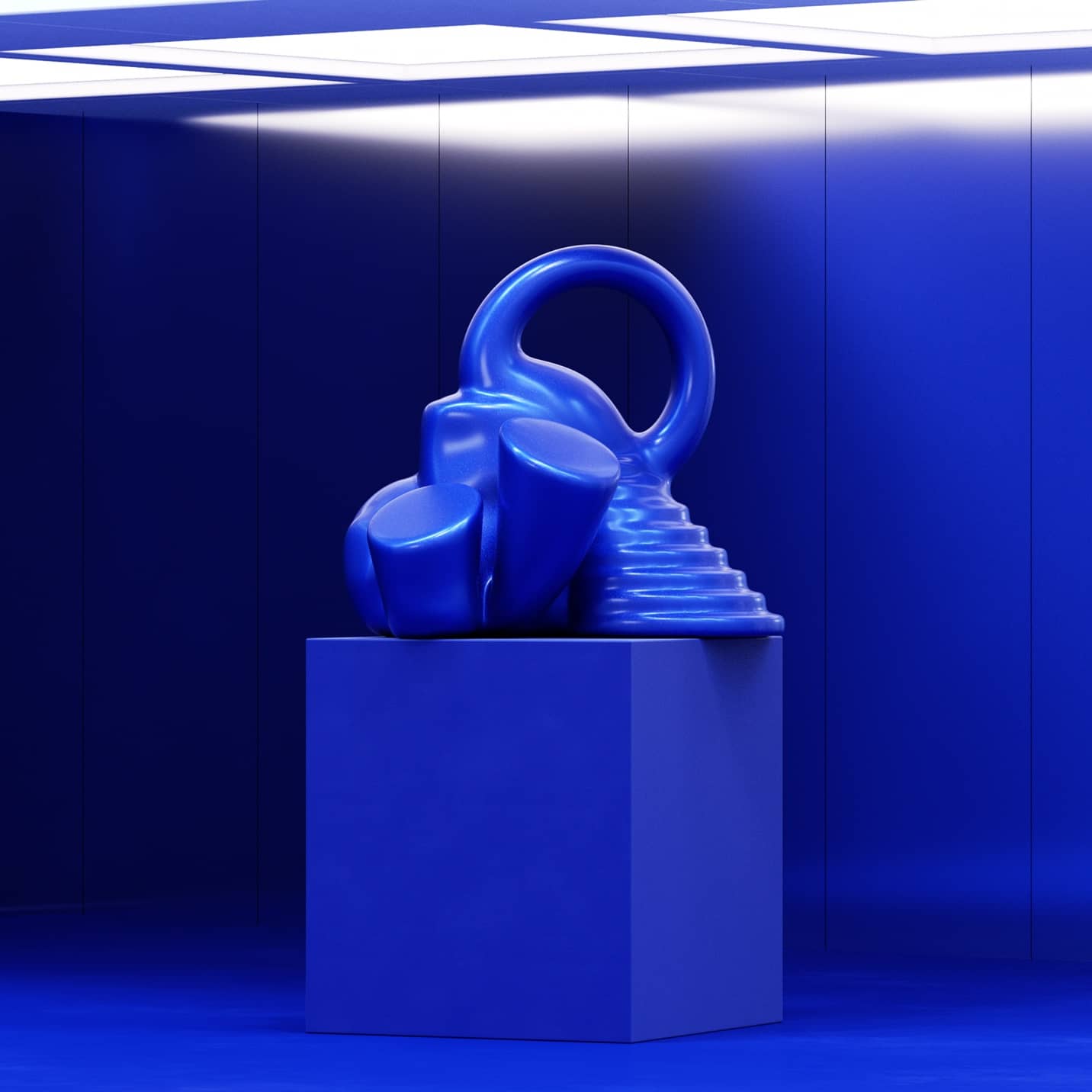
Clare Smith, Senior Color Strategist for WGSN, said: “We’re delighted to reveal our Color of the Year for 2027, Luminous Blue. With a dynamic quality, it’s both mysterious and eccentric, with versatility and a broad appeal that will resonate from occasion wear to active. WGSN’s market-leading forecasts provide the world’s most valuable brands with insights based on 93% accuracy.”
Key Color S/S 27: Energy Orange

Energy Orange emerges as a high-vibrancy hue that demonstrates resilience in the face of change, including climate change. It represents a call for product design to prioritize adaptability and innovation, offering vitality and a sense of security tailored to specific environments. This bright orange corresponds to the consumer desire for safety and protection.
Key Color S/S 27: Pop Pink
Pop Pink is joyful, uplifting and carefree, linking to a state of strategic joy and playfulness that will drive consumers and businesses in 2027. In order to rise above the stresses of the world, it will be key to design products that promote both serious and unserious fun, enjoyable wellness and analogue amusements as consumers young and old lean into play, whether alone or together.
Key Color S/S 27: Meadowland Green

Meadowland Green is a nourishing mid-green hue that evokes a sense of rest and carefree tranquillity. Going into 2027, people will embrace a slower pace of life, prioritizing relationships and experiences and opting for a return to basics. Amid a loneliness epidemic, a kindness crisis and growing pressures, societies will increasingly recognize that the ‘me’ cannot exist without the ‘we’.
Key Color S/S 27: Clay

Clay is a pink-toned neutral with a warm, earthy quality that feels both trustworthy and resilient. As the earth grows hotter, we look to clay for its cooling properties and as a functional material that balances beauty, utility, the ancestral and the futuristic, using time-honored tones and materials to find solutions to new problems.
Source: WGSN, www.wgsn.com