Abandoned Cart Emails That Close Sales

It was a Saturday night, around 11 PM, and I was innocently scrolling on Amazon to look for a gift for my best friend’s birthday. But then, it happened.
I had an impulse to purchase everything. The female empowerment mug? The wine tumbler? The pillow that said “Nap Queen”? I wanted it all. I added everything I liked to my cart.
$200. Let’s be honest: $200 was going to be hard to pull off. I left Amazon so I wouldn’t be tempted to complete the purchase.
My hesitation to check out triggered abandoned cart emails. An abandoned cart email is an email sent to customers who almost made a purchase to encourage them to complete their transaction.
Abandoned cart emails are one way to convert lost business and turn a lost prospect into a brand enthusiast.
Morgan Jacobson, an inbound marketing specialist on the e-commerce team at HubSpot, wrote about abandoned cart emails in this blog. He says, “First off if you’re doing any kind of shopping cart abandonment, you’re way ahead of the game. Currently, only 19% of even the top 1,000 e-commerce companies engage in any kind of shopping cart abandonment recovery. Which is interesting, given that up to half of the customers who abandon their carts will complete the purchase when asked.”
Here, you’ll find abandoned cart email templates to get you started, plus effective abandoned cart email examples to inspire your own.
Abandoned Cart Email Template
To build your abandoned cart emails, you can find templates in any email marketing tool. Tools like Squarespace, Wix, or HubSpot will have templates to help you get started. For instance, you can use a pre-made template for the layout but customize the message, images, and design. Here’s an example template from Wix:
Image source: Wix
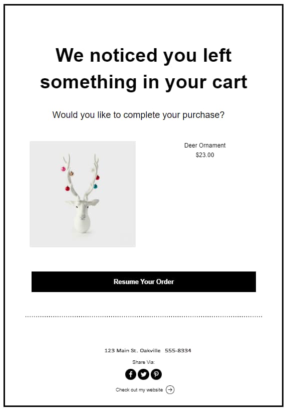
The messaging in abandoned cart emails is fairly simple. Below is an outline of the basic structure:
- Snappy subject line
- Introduction text
- Items left in the cart
- Offer or discount
- Checkout button or call to action (CTA)
- Reviews or social proof
- Closing text
While this outline is helpful if you’re sending one abandoned cart email, you might consider a drip campaign for your cart recovery emails. A drip campaign is a series of automated emails.
For an abandoned cart workflow, the emails could be structured like this:
- Email 1: Cart reminder (sent a few hours after cart abandonment)
- Email 2: Follow up (sent a few days later)
- Email 3: Promotional discount (sent a few days after email two)
According to Omnisend, a series of emails works 63% better than a single email for abandoned cart emails.
Jordan Pritikin, a team manager for HubSpot’s email and growth marketing team, says, “When you’re writing an abandoned cart email, personalization is key. What was the actual product or service that was abandoned? What value propositions resonate most with the individual you’re sending to? Why did they object to the purchase initially, and how can you, as the business, help assuage those objections? The more personal your abandoned cart email, the more likely it is to succeed!”
Whether you send one email or implement a full drip campaign, there are a few best practices to keep in mind when planning an abandoned cart email. For example:
- Timing: Send your abandoned cart emails within a few hours after a customer abandons their cart. For example, if you work at a company like Zappos, and someone doesn’t complete their purchase, you might send an abandoned cart email anywhere from three to five hours after they leave your site without completing a purchase.
- Personalization: Abandoned cart emails should be personalized to the customer you’re sending them to by including the items that were left in their cart and addressing them by name.
- CTA: Your abandoned cart email should encourage customers to complete their purchases. For example, the CTA might be something like “Buy Now” or “Resume Your Order.”
- Copywriting: The copy should be snappy, concise, and compelling. Great copywriting is interesting enough to entice someone to complete their purchase. See some examples below.
- Subject line: Your subject line should be interesting enough to get people to open the email. For example, using something like discounts, humor, or questions could intrigue the customer enough to click. If you wanted to include a promotional offer, your subject line could be something like “20% off all purchases.”
- Social proof: You can use reviews and testimonials to strengthen your branding and create FOMO (fear of missing out) among customers who abandoned their cart. For example, including reviews for specific products in your abandoned cart emails can tempt someone to purchase.
Best Abandoned Cart Email Examples
1. Whiskey Loot
Image source: Really Good Emails
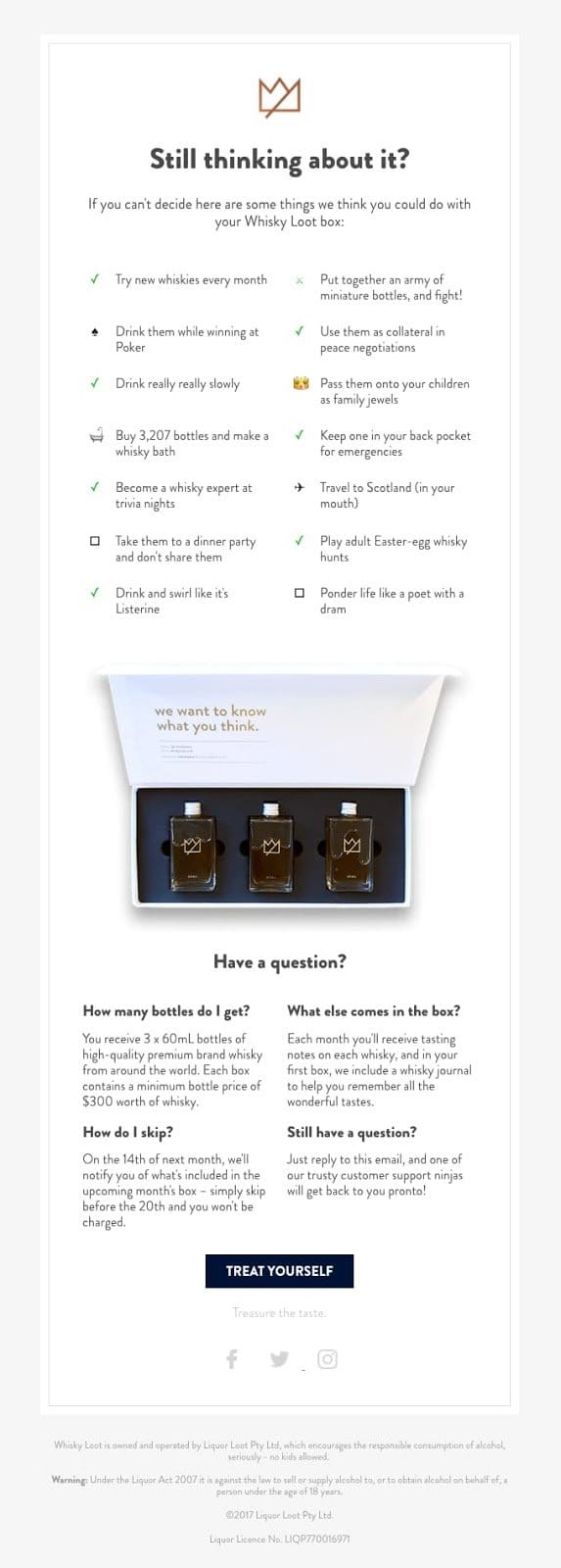
Whiskey Loot’s abandoned cart email utilizes unique and engaging copywriting to entice customers to complete their purchases. They include a list of reasons to purchase their whiskey, provide answers to frequently asked questions, and use clean design to draw your eye to the CTA. With this abandoned cart email, the customer has all the information they might need to complete a purchase.
2. Peel
Image source: Really Good Emails
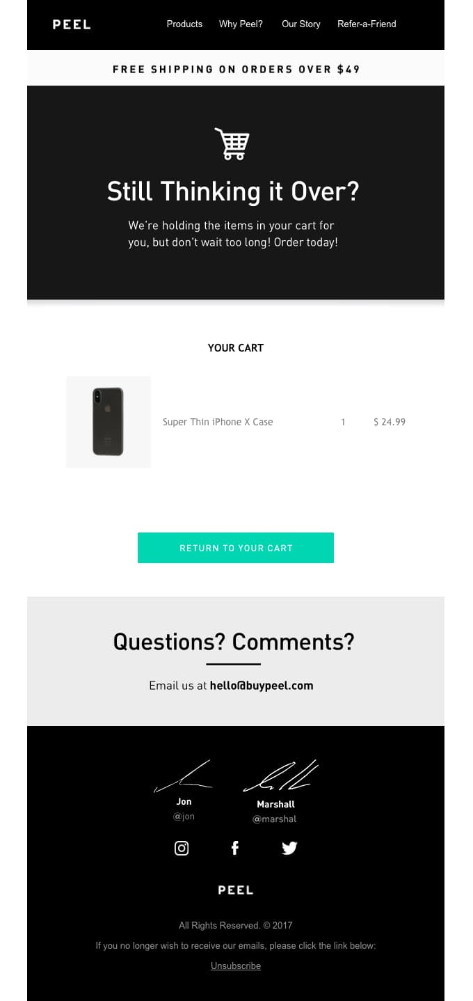
The best element of Peel’s abandoned cart email is the free shipping offer. Not only do they encourage customers to purchase what’s in their cart, but they also include an incentive for buyers to add more items to their cart and complete checkout. In addition, this is a classic layout for an abandoned cart email: intro text, items in the cart, CTA, questions, and footer.
3. 23andMe
Image source: Really Good Emails
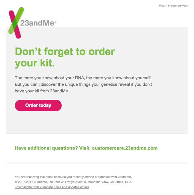
Short, sweet, and to the point, 23andMe has an abandoned cart email with only a few elements: introduction text (“Don’t forget to order your kit”), CTA (“Order today”), and closing text offering answers to questions (“Have additional questions?”). With this email, customers won’t get distracted by extraneous information and will focus on the action 23andMe wants: purchase completion.
4. Dyson
Image source: Really Good Emails
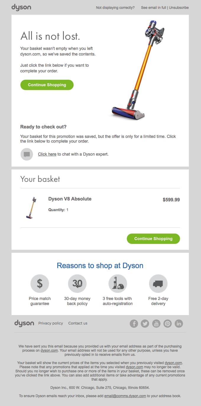
In this example, Dyson does several things very well:
- They use clear text that is helpful and fun to read. For example, “All is not lost” and “We saved the contents” let the customer know that Dyson wants to be helpful.
- They include an image of the product and list the item still in the customer’s cart.
- They add a sense of urgency. The text, “Your basket for this promotion was saved, but the offer is only for a limited time,” creates a sense of importance about this purchase.
- They include two CTA buttons. This allows customers on mobile to see a CTA button even as they scroll down. These buttons make it easy to complete their purchase at every touchpoint.
Overall, this email includes the right elements while showcasing a sleek, clean design that makes it easy to read.
5. Virgin Atlantic
Image source: Really Good Emails
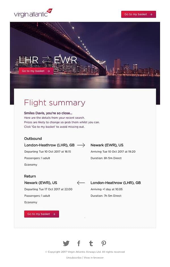
In this example, Virgin Atlantic uses engaging text and three CTA buttons to encourage customers to complete their purchases. The personalized intro text, “Smiles Davis, you’re so close…” makes customers feel like they’re being spoken to directly while reminding them how close they are to travel.
This email also includes flight information, so they have everything they need to make a purchase. This is a good example to follow when writing your own abandoned cart emails because it takes away any roadblocks for the customer.
6. Ugmonk
Image source: Really Good Emails
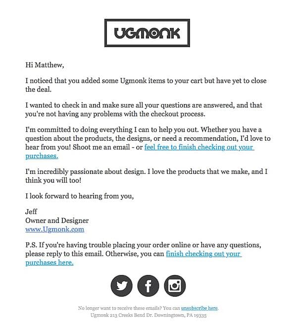
Ugmonk uses a different approach to their abandoned cart email. They focus entirely on personalization, making it seem like the owner and designer are reaching out directly to answer any questions. Plus, this includes two in-line CTAs so the customer can finish checking out instantly if they want. This is a simple approach that your target audience may prefer.
7. Drop
Image source: Really Good Emails
Drop’s abandoned cart email is a good example because of its use of images and copywriting. Drop creates urgency in the bolded text “ends in 19 days.”After they create urgency and include their CTA, they add other items that the customer might be interested in based on what’s in their cart. This is a good strategy to get the customer back on their site browsing other items they might want, hopefully turning into a completed purchase.

8. Google
Image source: Really Good Emails
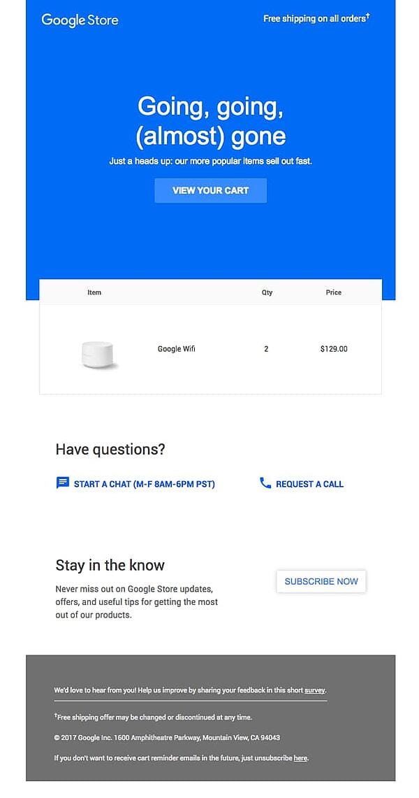
This is a perfect example of an abandoned cart email because it includes every element: Great copywriting, clear CTA, personalization by showing the customer’s cart, and urgency. With text like “Going, going, (almost) gone” and “Our popular items sell out fast,” customers are engaged. They also feel compelled to complete their purchase so they don’t miss out. This email closes with a CTA to answer questions and subscribe to their product updates. Again, Google focuses on ensuring the customer feels like they don’t want to miss out on anything.
9. Target
Image source: Really Good Emails
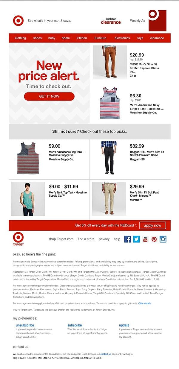
Target takes a different approach in their abandoned cart email by offering a discount on the items in the customer’s cart. The text “New price alert” and “Time to check out” make it hard to walk away. But if that approach doesn’t work for their customers, Target also includes similar items to get them browsing and shopping again.
10. Casper
Image source: Really Good Emails
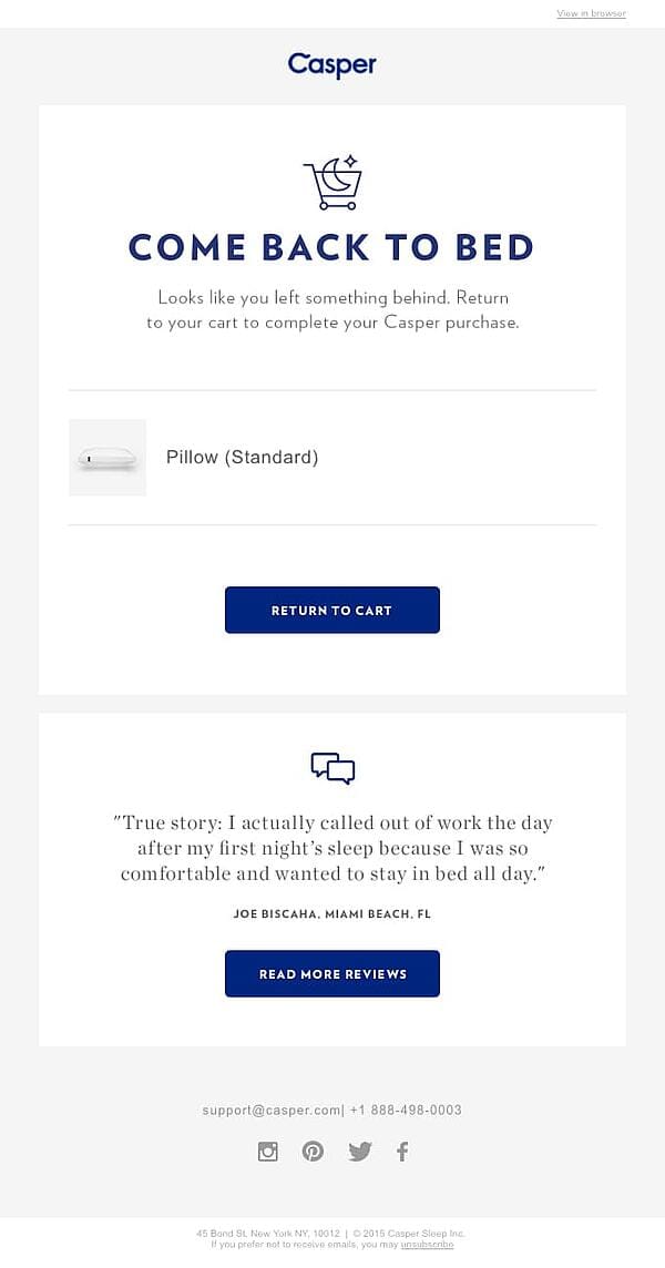
What I love about this example is that Casper uses social proof. Word of mouth and reviews are becoming increasingly important in the world of marketing. When people don’t complete a purchase, it might be because they haven’t finished their research. Casper’s abandoned cart email makes it easy for the customer to pick up where they left off in regard to their research. Plus, it includes snappy text and clear CTA buttons that entice the customer to continue shopping.
11. Dote
Image source: Really Good Emails
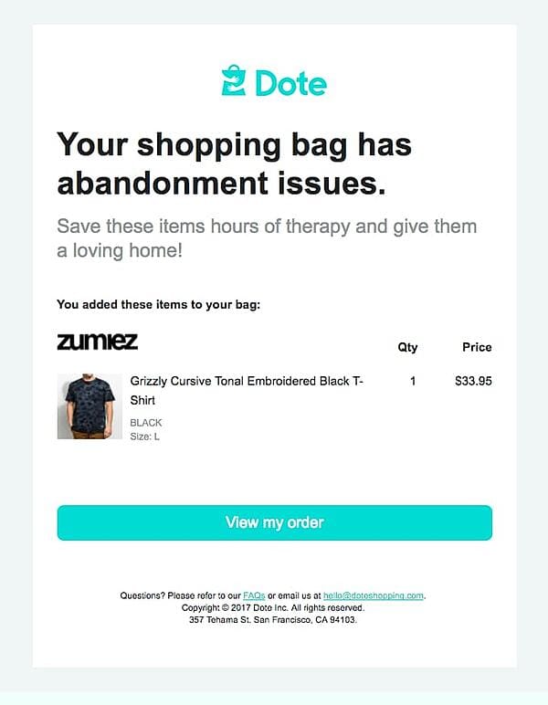
Funny, interesting text is the way to your customer’s heart. Dote excels at it with humorous copywriting. In their email, they say, “Your shopping bag has abandonment issues” and “Save these items hours of therapy and give them a loving home.” This text is entertaining, which makes the brand compelling to its customers. This example showcases how to use abandoned cart emails to illustrate your brand’s personality and create brand enthusiasts. Plus, this is short, sweet, and to the point, making it easy to continue shopping.
11. Moschino
Image source: Really Good Emails
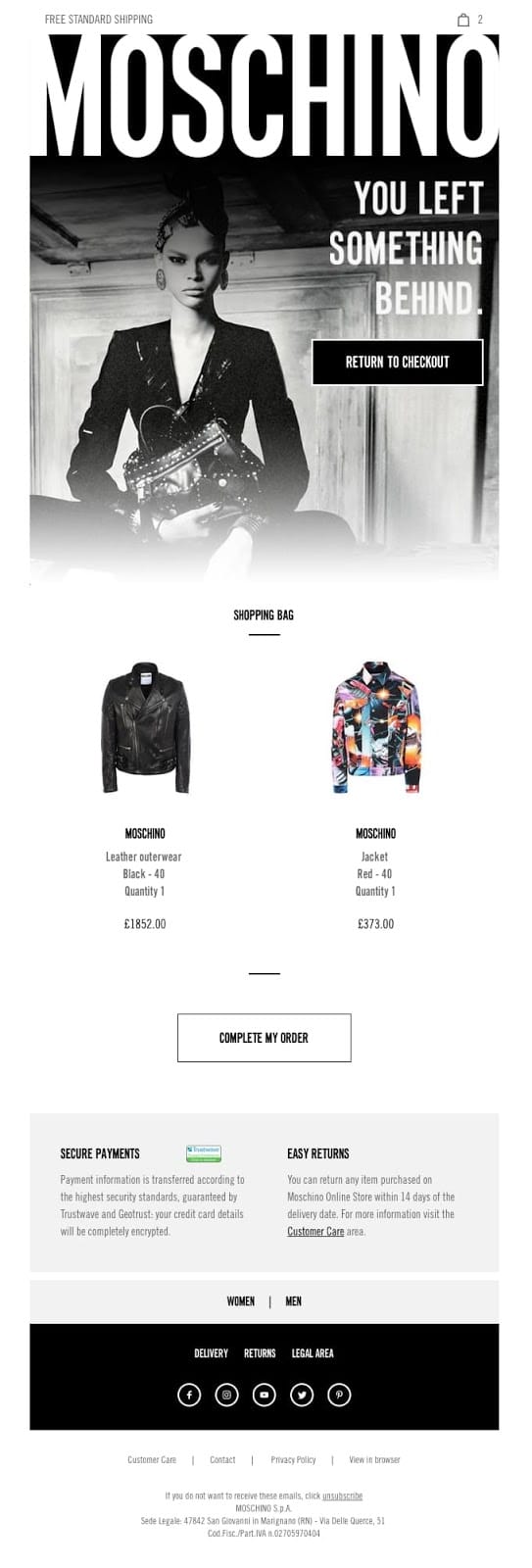
The bottom of Moschino’s email is unique because it includes information on secure payments and easy returns. For clothing e-commerce businesses, these are some of the top reasons that customers don’t want to make a purchase online. With their abandoned cart email, Moschino is trying to quell any doubts and take away any reason for hesitation. In addition, they also list the items in the cart and use clear CTAs.
Undoubtedly, there are many different approaches to the abandoned cart email. We suggest A/B testing different variations to see what works for your audience. Do they prefer personalized emails? Discounts? Humorous text? It’s important to find out.
Abandoned cart emails can create brand enthusiasts and delight customers at every touchpoint. You can earn your customer’s trust and loyalty with stellar copywriting and branding.
Source: HubSpot